
Graphic design is much more than making things look beautiful. It is a way of communicating ideas through colors, images, text, shapes, and layouts. From the logo on your favorite coffee cup to an Instagram post you stop scrolling to read, graphic design is quietly present in everyday life.
If you’re new to graphic design, you might look at professional designs and think, “How do they make it look so easy?” The truth is, good design usually comes from understanding a few basic principles and practicing them again and again.
You don’t need to be an amazing artist to begin. You need curiosity, patience, observation, and a willingness to experiment.
Let’s understand graphic design in simple, practical language.
What Is Graphic Design?
Graphic design is the process of creating visual content to communicate a message, idea, or feeling.
A designer combines different elements such as:
- Text
- Images
- Colors
- Shapes
- Lines
- Spacing
- Typography
- Layouts
Think about a simple food poster. The food image attracts your attention, the heading tells you what’s being offered, the colors create a particular mood, and the price gives you useful information.
Everything has a purpose.
That’s what makes graphic design interesting. A good design isn’t just decoration; it helps people understand something.
Why Is Graphic Design Important?
We live in a world where people see visual content everywhere. Social media feeds, websites, advertisements, product packaging, presentations, and mobile apps all depend on visual communication.
A strong design can help a business:
- Build brand recognition
- Attract attention
- Communicate information quickly
- Look more professional
- Connect with customers
- Create a memorable impression
Imagine seeing two advertisements for the same product. One is crowded with text, random colors, and poor-quality images. The other has a clear headline, attractive visuals, and enough empty space.
Which one would you trust more?
That first impression is one reason design matters.
Basic Elements of Graphic Design
Before creating complicated designs, learn the basic building blocks.
| Element | What It Does |
|---|---|
| Color | Creates mood and attracts attention |
| Typography | Makes written information readable and expressive |
| Shape | Adds structure and visual interest |
| Line | Separates or connects different elements |
| Space | Gives the design room to breathe |
| Images | Communicate ideas quickly |
| Size | Shows importance and creates hierarchy |
| Texture | Adds depth and visual character |
You don’t need to use every element in every project.
Sometimes, a simple design can communicate much more effectively than an overloaded one.
Understanding Color in Graphic Design
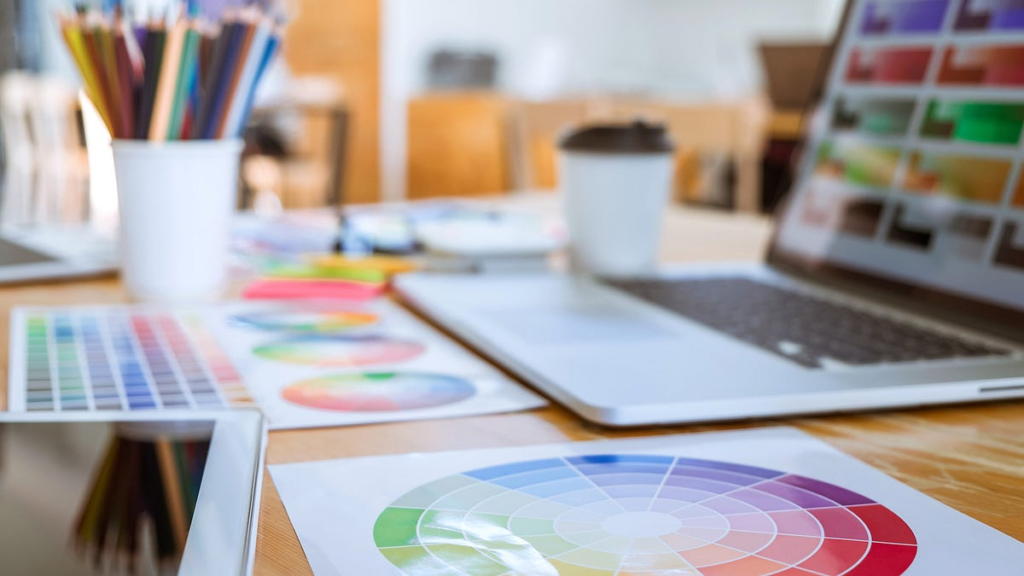
Color is often one of the first things people notice.
Different colors can create different moods and associations, although their meaning can change depending on culture, context, audience, and purpose.
For example, a soft green palette might work well for a nature-related brand, while a bold contrasting palette might suit an energetic promotional campaign.
As a beginner, don’t try to use every color you like.
Start with a small palette.
One practical approach is to choose a main color, a supporting color, and an accent color.
| Color Approach | Possible Effect |
|---|---|
| Monochromatic | Simple and harmonious |
| Complementary | Strong contrast |
| Analogous | Smooth and connected |
| Neutral + Accent | Clean and modern |
The goal isn’t to find the “prettiest” colors. The goal is to choose colors that support your message.
Typography: More Than Just Choosing a Font
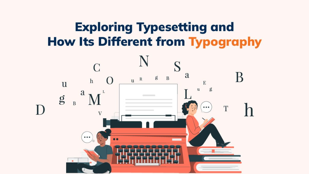
Typography is the art and practice of arranging text.
It includes:
- Font selection
- Font size
- Line spacing
- Letter spacing
- Alignment
- Font weight
- Text hierarchy
A common beginner mistake is using too many fonts.
You see a beautiful font and think, “This one would look amazing too!” Then another catches your eye, and suddenly your poster has five different fonts.
Keep it simple.
For most designs, two well-matched fonts can be enough.
For example:
Heading: Bold and attention-grabbing
Body: Simple and easy to read
Remember, a font can look beautiful but still be difficult to read. Readability should always come first.
What Is Visual Hierarchy?
Visual hierarchy tells people where to look first.
Think about a movie poster. Usually, your eyes notice the title or main image before the smaller details.
Designers create this effect using:
- Size
- Contrast
- Color
- Position
- Spacing
- Font weight
If everything is large and bold, nothing feels important.
So ask yourself:
“What should people notice first?”
Then make that element visually stronger.
White Space Makes a Difference
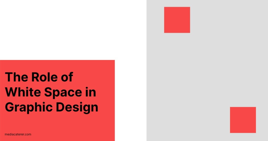
White space is the empty area between and around design elements.
Some beginners worry that empty space makes a design look unfinished.
Actually, white space can make a design feel clean, comfortable, and easier to understand.
Think about a room. When every corner is filled with furniture, it can feel crowded. When there is enough space to move around, the room feels more comfortable.
Design works in much the same way.
Give your text and images some breathing room.
Alignment Creates Order

Alignment is another simple principle that can make a design look much more professional.
When headings, images, buttons, and paragraphs line up properly, the design feels organized.
Common types include:
- Left alignment
- Center alignment
- Right alignment
- Grid alignment
You don’t need to make everything perfectly symmetrical.
The important thing is that your choices feel intentional rather than random.
Contrast Helps Important Things Stand Out
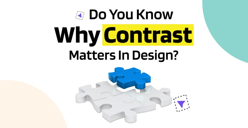
Contrast creates visual difference between elements.
You can create contrast using:
Light and dark
Large and small
Bold and regular
Bright and muted
For example, a dark headline against a light background can immediately attract attention.
But too much contrast can make a design feel chaotic.
Good design knows when to stand out and when to stay quiet.
Balance Your Design

Balance means distributing visual weight across your layout.
Imagine putting a very large image on one side of a poster and leaving the other side almost empty. Unless that’s intentional, the design might feel uncomfortable.
Balance can be:
- Symmetrical
- Asymmetrical
- Radial
Asymmetrical designs can be especially interesting because they can feel modern and energetic.
Don’t worry about making everything perfectly equal.
Focus on making the whole composition feel balanced to the eye.
Consistency Builds Strong Designs
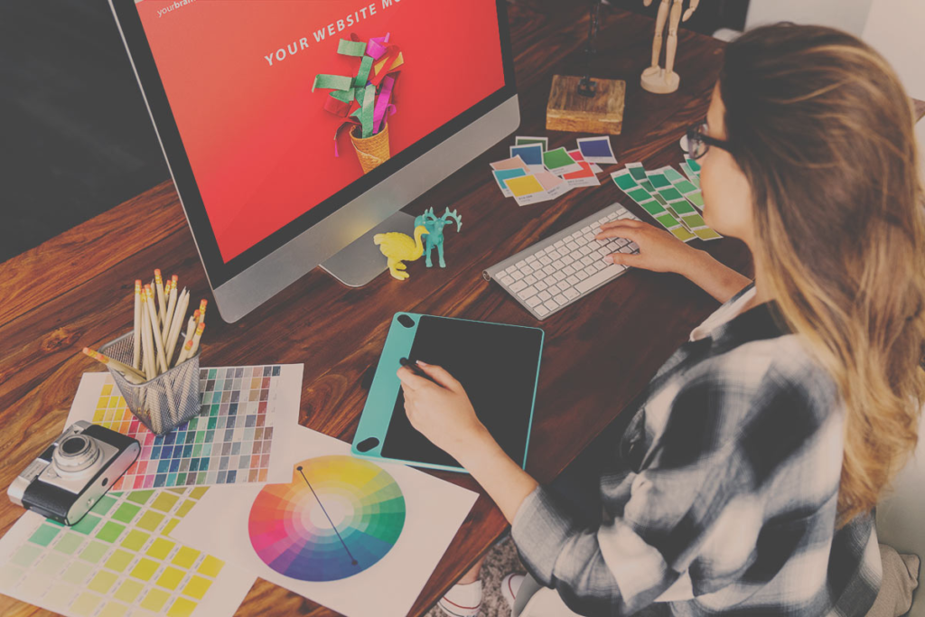
Consistency becomes especially important when designing for a brand.
Imagine a company using blue in one post, orange in another, five different fonts, and a different logo every week. It would be difficult to recognize.
A consistent visual identity helps people remember a brand.
| Brand Element | Keep Consistent |
|---|---|
| Logo | Use approved versions |
| Colors | Maintain a defined palette |
| Fonts | Choose a small font system |
| Images | Keep a similar visual style |
| Layouts | Follow recognizable patterns |
These small details might not seem exciting, but they can make a brand feel reliable and professional.
Best Graphic Design Tools for Beginners
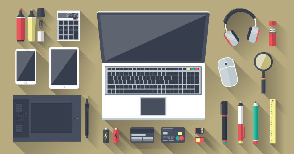
You don’t need expensive equipment to start learning.
Popular tools include:
| Tool | Best For |
|---|---|
| Canva | Beginner-friendly graphics and social posts |
| Adobe Photoshop | Photo editing and creative designs |
| Adobe Illustrator | Logos, icons, and vector graphics |
| Figma | UI design and collaboration |
| Adobe Express | Quick marketing graphics |
My practical advice is simple: don’t spend all your time searching for the perfect tool.
Choose one that fits your needs and start practicing.
Your creativity and understanding of design principles matter more than having ten different applications.
How to Learn Graphic Design as a Beginner
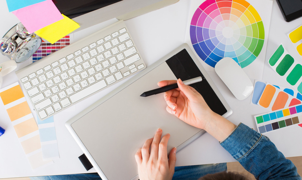
Learning graphic design doesn’t have to feel overwhelming.
Start with small steps.
Step 1: Learn the fundamentals.
Understand color, typography, spacing, contrast, alignment, and hierarchy.
Step 2: Choose one design tool.
Learn the basic features instead of trying to master everything at once.
Step 3: Study designs you like.
Look at posters, websites, packaging, advertisements, and social media graphics.
Ask yourself:
“Why did this catch my attention?”
“What did I notice first?”
“Why does this layout feel comfortable?”
This kind of observation slowly develops your design eye.
Step 4: Create small projects.
Try designing a poster, social media post, thumbnail, business card, or simple brand concept.
Step 5: Get feedback.
Show your work to someone and ask what they notice first.
Sometimes another person’s simple comment can help you see something you completely missed.
Common Graphic Design Mistakes
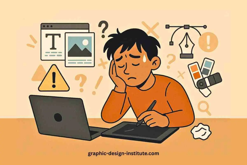
Mistakes are part of learning. Still, avoiding a few common ones can make your progress easier.
| Common Mistake | Better Approach |
|---|---|
| Too many fonts | Use 2–3 fonts maximum |
| Too many colors | Keep a simple palette |
| Too much text | Keep the message focused |
| Poor spacing | Give elements enough breathing room |
| Low-quality images | Use clear, suitable visuals |
| Everything looks important | Create visual hierarchy |
| Too many effects | Keep the design purposeful |
One of my favorite practical tips is to take a short break after finishing a design.
When you stare at the same design for too long, your eyes become used to it. After a few minutes away, you may suddenly notice something that feels too crowded or out of place.
That little pause can be surprisingly helpful.
How to Become More Creative at Design
You don’t have to be “naturally creative” to become good at graphic design.
Creativity grows through practice, observation, experimentation, and curiosity.
Look around you.
Notice a café menu.
Look at a product package.
Pay attention to a billboard.
Observe how your favorite app uses colors and buttons.
Even nature can inspire design. The soft colors of a sunrise, the patterns on leaves, the balance of a landscape, or the contrast between light and shadow can give you ideas for layouts and color combinations.
The more carefully you observe the world around you, the more visual references you collect.
Don’t Chase Every Design Trend
Trends can be useful, but following every trend isn’t always a good idea.
A design might look fashionable today and feel outdated a few months later.
Instead of asking:
“What design is trending right now?”
also ask:
“Does this style fit my audience and message?”
A simple, thoughtful design can stay effective much longer than something created only to follow